
These pictograms were intended to show smooth movements. The pictogram's border also contributes with the movement of the overall group by showing round corners instead of stoppable lines.
 I thought this was pretty neat since the cat is made of a few simple lines and you still can figure out everything it is doing just by changing the lines up.
 The two olympic pictograms are bold with black background and white figures along with little details, such as arms, legs and belly. You can see different lines to shape bodies. The movements are great and tells you what kind of sports displayed.


 These are by Anthony Dimitre. I chose them mostly because of their off-beat character and how they are all completely different in terms of topic yet are all very obviously by the same artist. They fit together very well regardless of their varying genres.
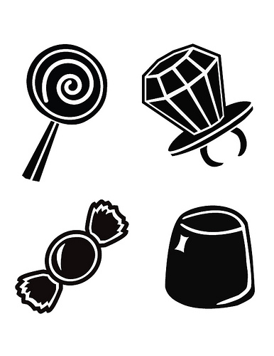
 These are also by Anthony Dimitre, I thought the bottom two in the set were worth posting since it is similar to what we are working on now. They are very clear and simple.
 This set is from iconwerk and I really like how detailed they are while maintaining extreme simplicity. All of them are immediately identifiable.
 I like this pictogram because of the lines used to produce the image. I also like the symbols represented within. For the most part, the symbols represent me and who I am as a person, because I love music and play an instrument. I consider myself a master crafter, and I also love to sail as well as nature.

I would like to create pictograms based off of hieroglyphics. Egyptian art is really interesting to me, and it would fun to incorporate twisted perspective in to each picture. The hieroglyphics came from karenswhimsy.com.


 What drew me to this series was how the designer created unity between the icons. All of the icons have a square shape to them, to where almost a perfect square could be drawn around each of them. I thought that it was a very smart way to unify them all in a simple way.


