Monday, September 20, 2010

Garden of the Gods

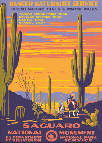
This particular poster caught my attention because of its composition and the great use of colors. Each color is used to designate only the feature it is used for. The orange for the jutting rock structures, yellow for the sky and clouds suspended in it and then a cool green used for the trees. As if to make it seem like the rocky outcroppings are stranded in the middle of some unorthodox tree ocean. Plus the sheer detail within the picture, almost every tree is individually defined, every crevice and crack can be seen on the rock faces and then the billowy light clouds.

Devils Tower

I used this poster of Devils Tower because I liked it. I like the use of colors as well as the placement of everything.
The Zion National Park poster brought my attention because of the use of color, the shades and tints and how it makes the viewer see different perspectives through the use of horizontal, vertical and diagonal lines to show the perspective of the poster. the use of color was able to give it a warm, yet color tone and it was able to balance the the composition.

I liked the kings canyon poster because of the contrasting color pallet, and the composition is interesting because of the way the light shining through the trees is illustrated.

Acadia National Pork...mmmmm


I feel as this composition was well thought out from the color scheme to the placement of the elements and overall balance within the picture

Crater Lake, Oregon


I found this poster to be the most appealing because it found a way to make land, water and sky all equally appealing without a specific focus on one natural landscape. The colors are eye-popping and the mustard yellow provides draws the eye without being too overbearing.

poster assignment


I like this poster because of the color palette and the monumentality of the composition.

Hawaii National Park

I think the use of color is great in this poster, the bright orange really pops and gets your attention. I also like the different levels of the mountains.

Crater Lake National Park

I chose the crater lake poster because it is the location I was wanting to use it for my own project. I really like this view of the lake and think the bold colors used in these posters really makes things much more interesting.
Este Park Colorado Poster
I like this poster, it is so natural and with bold colors. The objects looked really simple to draw.


Saguaro National Monument poster

This poster jumped out at me for many different reasons. First of all, the sky is so big and reminds me of home. I like how the people on horseback put into perspective how big the cactus are. The mountains in the background really complete the piece, and the colors are used effectively. The placement of the objects also works well. I like the fact that nothing is put in the exact center of the canvas.

Sequoia


This poster caught my eye because of its warmth and contrast. It has a relaxing mood, and it has a distinct foreground, middleground and background. I like how the tree in the foreground kind of frames the poster, and the vertical and horizontal images allow your eye to travel around the composition, giving it nice visual movement.

Yellowstone National Park- Geyser


First off, I like this poster's composition, it shows movement and really draws a viewer in with its sweeping lines. I posted two versions of it which show how much color impacts and changes an image, the poster on the left has an airy feel to it while the one on the left has contrasting colors in it which add a lot of drama to it.