 The Zion National Park poster brought my attention because of the use of color, the shades and tints and how it makes the viewer see different perspectives through the use of horizontal, vertical and diagonal lines to show the perspective of the poster. the use of color was able to give it a warm, yet color tone and it was able to balance the the composition.
Showing posts with label Travel Poster. Show all posts
Showing posts with label Travel Poster. Show all posts
Monday, September 20, 2010
The Zion National Park poster brought my attention because of the use of color, the shades and tints and how it makes the viewer see different perspectives through the use of horizontal, vertical and diagonal lines to show the perspective of the poster. the use of color was able to give it a warm, yet color tone and it was able to balance the the composition.

Crater Lake, Oregon

I found this poster to be the most appealing because it found a way to make land, water and sky all equally appealing without a specific focus on one natural landscape. The colors are eye-popping and the mustard yellow provides draws the eye without being too overbearing.
Saguaro National Monument poster
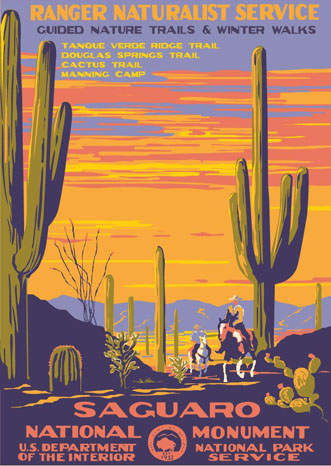
This poster jumped out at me for many different reasons. First of all, the sky is so big and reminds me of home. I like how the people on horseback put into perspective how big the cactus are. The mountains in the background really complete the piece, and the colors are used effectively. The placement of the objects also works well. I like the fact that nothing is put in the exact center of the canvas.
Subscribe to:
Posts (Atom)