
Wednesday, October 6, 2010

Tabloid Cover

I chose this headline because it is pretty funny. I like how they continued the story through out the title and have a lovely drawing of the swamp monster. . .The creature WILL attack again..
Face of Satan seen over US Capitol!
 I personally like this tabloid. It is simple with only two pictures, yet it gives you the essential information and it takes a good effect on the pictures and overall mood. The placement of the text also helps emphasize the face of "Satan" and it gives a new perspective to viewers.
Bat Child

Assignment3

Abby Lincoln

I like how this cover just keeps going. From saying he was a woman to the shocking pictures, all the way to Booth being a "jilted lover". It's a great example.
Monday, October 4, 2010
Kitty Killer

I really like this one because it's cute, simple, and funny. I especially liked the "sign the petition or she dies!" Images like the cat face and the hand would be easy things to take pictures of. I like how simple the cover is...too much text and too many pictures can sometimes be distracting.
Garden of Eden Found
 I like how this cover has used the contrast in the photos to its advantage. There are a lot of dark areas in this cover and the areas have balanced it out very well with the white bold typing. Also I like how it isn't so busy, its a lot easier on the eye than a lot of the others I saw.
tabloid cover
 I chose this cover because I thought it was funny. I also liked the layout of the cover as well.

Vampire Cat

I liked this cover because it took simple pictures such as a cat, baby, and a monkey, computer and made an awesome cover story. The layout is nice, and I'm enjoying the choice of font.
Der Fuhrer in einem Rock?!!

Jesus Flip Flop Found
 I chose this image because it is...beyond ridiculous. I admire the use of photoshop in a semi-creative manner. This story in particular captures the ENTIRE cover...in other words, nothing is bigger than Jesus.
Monday, September 20, 2010
Garden of the Gods

This particular poster caught my attention because of its composition and the great use of colors. Each color is used to designate only the feature it is used for. The orange for the jutting rock structures, yellow for the sky and clouds suspended in it and then a cool green used for the trees. As if to make it seem like the rocky outcroppings are stranded in the middle of some unorthodox tree ocean. Plus the sheer detail within the picture, almost every tree is individually defined, every crevice and crack can be seen on the rock faces and then the billowy light clouds.
Devils Tower
 I used this poster of Devils Tower because I liked it. I like the use of colors as well as the placement of everything.
 The Zion National Park poster brought my attention because of the use of color, the shades and tints and how it makes the viewer see different perspectives through the use of horizontal, vertical and diagonal lines to show the perspective of the poster. the use of color was able to give it a warm, yet color tone and it was able to balance the the composition.

Acadia National Pork...mmmmm
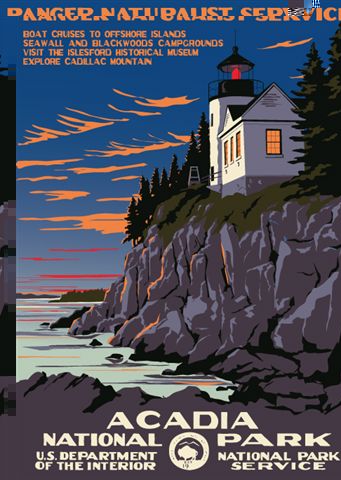
I feel as this composition was well thought out from the color scheme to the placement of the elements and overall balance within the picture
Crater Lake, Oregon

I found this poster to be the most appealing because it found a way to make land, water and sky all equally appealing without a specific focus on one natural landscape. The colors are eye-popping and the mustard yellow provides draws the eye without being too overbearing.
poster assignment

I like this poster because of the color palette and the monumentality of the composition.
Subscribe to:
Posts (Atom)